Title: Ponte Salario
Post by: Dune on October 09, 2012, 07:44:12 AM
Post by: Dune on October 09, 2012, 07:44:12 AM
I found some interesting images of a long gone Roman bridge, so I decided to make one. Hopefully it'll turn out nice enough for a 'romantic' Italian riverscape, with a road and all. Here's a premature test, I still have to texture the thing (a lot of work). I'll also post a painting of it, so you see how much work has to be done yet.


Title: Re: Ponte Salario
Post by: fleetwood on October 09, 2012, 12:01:04 PM
Post by: fleetwood on October 09, 2012, 12:01:04 PM
Interesting. Maybe it's just me, but the two artists seem to differ some on how massive the structure is in
comparison to their human figures. The scale in the painting seems easier to accept.
comparison to their human figures. The scale in the painting seems easier to accept.
Title: Re: Ponte Salario
Post by: Dune on October 10, 2012, 03:51:01 AM
Post by: Dune on October 10, 2012, 03:51:01 AM
Well, that's what art is all about; making an impression, a statement. And the etcher probably wanted to impress viewers by his hugely impressive stone structure. The images differ in other aspects too, so I'll have to find a balance... make my own impression ;). The building is quite finished now, so it's time for the ivy generator once again.....
Title: Re: Ponte Salario
Post by: Walli on October 10, 2012, 03:55:50 AM
Post by: Walli on October 10, 2012, 03:55:50 AM
looking nice already. I think it would be nice to UV map and create a bitmap based texture for that structure. Looking for your IVY now ;-)
Title: Re: Ponte Salario
Post by: Dune on October 10, 2012, 08:35:08 AM
Post by: Dune on October 10, 2012, 08:35:08 AM
I will... I did, Walli. This was just a quick procedural texture, without even UV'd. Now for some ivy, indeed. Any other ideas for additions or else to the structure, guys?


Title: Re: Ponte Salario
Post by: mhaze on October 10, 2012, 09:08:17 AM
Post by: mhaze on October 10, 2012, 09:08:17 AM
Impressive! I look forward to the final result.
Title: Re: Ponte Salario
Post by: Walli on October 10, 2012, 09:13:27 AM
Post by: Walli on October 10, 2012, 09:13:27 AM
great!
Title: Re: Ponte Salario
Post by: Kadri on October 10, 2012, 11:20:56 AM
Post by: Kadri on October 10, 2012, 11:20:56 AM
Looks nice , Ulco!
Title: Re: Ponte Salario
Post by: j meyer on October 10, 2012, 11:57:24 AM
Post by: j meyer on October 10, 2012, 11:57:24 AM
Nice model.
Some damage to break up all the clean edges would be an improvement methinks.
Keep going,J.
Some damage to break up all the clean edges would be an improvement methinks.
Keep going,J.
Title: Re: Ponte Salario
Post by: Dune on October 10, 2012, 12:05:20 PM
Post by: Dune on October 10, 2012, 12:05:20 PM
Damage is hard to inflict upon it, I'm afraid. And now that it's textured, I'm a bit reluctant; still being quite a novice in modeling. I don't want the poly count too high. Made some ivy just now, but still have to render a new one. That'll cover up a lot!
This is just for testing; my goal is a nice Italian landscape ::)

This is just for testing; my goal is a nice Italian landscape ::)
Title: Re: Ponte Salario
Post by: Icegrip on October 10, 2012, 01:34:07 PM
Post by: Icegrip on October 10, 2012, 01:34:07 PM
Wow, very nice model there! Which program did you use?
And how did you setup the clouds for making such fog? :)
And how did you setup the clouds for making such fog? :)
Title: Re: Ponte Salario
Post by: inkydigit on October 10, 2012, 03:17:44 PM
Post by: inkydigit on October 10, 2012, 03:17:44 PM
wow indeed!
...great mist/fogginess too!
...great mist/fogginess too!
Title: Re: Ponte Salario
Post by: TheBadger on October 10, 2012, 05:25:37 PM
Post by: TheBadger on October 10, 2012, 05:25:37 PM
Ulco, this is the best model *I* have seen from you so far! Its got some great details.
I think damaging it would be cool, but not at all necessary. If you are going to portray the structure in its own time, it would not show damage from age, but it would still be filthy. The old world was disgusting, dirty filthy ;D But you have some dirt in there already and that looks real nice.
2 things...
It would be great, if you have the time and inclination, to also think about detailed human figures for the final composition. People would clarify scale perfectly! And also, I think that is the area of TG2 that has the least amount of topics. It would be nice to see some more ground broken on that subject.
And perhaps, rather than lots of mountains in the background, or any kind of big terrain, you could put some of you lower polly models in the background to form a village in the distance.
I have to say that I know TG2 is almost all about terrains, but the renderer is just so good and easy to use, it makes models look great!
I would also like to know more about your modeling in general.
Title: Re: Ponte Salario
Post by: Dune on October 11, 2012, 03:29:01 AM
Post by: Dune on October 11, 2012, 03:29:01 AM
Thanks, Michael. There's no rush in building this one as it's private, although I'm always in a hurry to see results :-\ So I'm gradually building it up in Lightwave, pulling it through Poseray to weld vertices again and recalculate normals. There's a balcony with a roof that I'm not satisfied with yet. Wood at first, then red tiles, but as a texture, which turns out too flat. So I'm making some real tiles now. Maybe add some broken corner stones, if I can. Perhaps a chair and a bottle and some other small stuff. I'm no good at people.
Clouds are real easy, here's the tgd. Don't mind the absent obj's.
Clouds are real easy, here's the tgd. Don't mind the absent obj's.
Title: Re: Ponte Salario
Post by: Dune on October 11, 2012, 08:01:07 AM
Post by: Dune on October 11, 2012, 08:01:07 AM
Roof change. There's also a chair and two glass bottles somewhere now.

Title: Re: Ponte Salario
Post by: otakar on October 11, 2012, 04:17:02 PM
Post by: otakar on October 11, 2012, 04:17:02 PM
Beautiful model. The level of detail needed always depends on the final scene(s) and resolution. Often times you won't be able to discern any weathering or dirt from further away. It may be wiser to spend the time to integrate the object better into the environment, which is also important :)
Title: Re: Ponte Salario
Post by: TheBadger on October 11, 2012, 05:13:16 PM
Post by: TheBadger on October 11, 2012, 05:13:16 PM
Hi Ulco.
Thought you may be able to use this. It is a construction materials supplier web site that has some very large and very good photos of roofing materials. I know from experience the images make great textures.
Home: http://www.rooftile.com/tile.html click on an example image. Then click on "view product page" then click on the item again to see a large example.
Here is just on example: http://www.rooftile.com/media/catalog/product/cache/1/image/9df78eab33525d08d6e5fb8d27136e95/F/-/F-TAUP-AA-TS.jpg
A little photoshop goes a very long way!
Title: Re: Ponte Salario
Post by: Dune on October 12, 2012, 04:04:51 AM
Post by: Dune on October 12, 2012, 04:04:51 AM
TY, Michael and Otakar. You can see in this iteration that integration is indeed important; it's nowhere near where I want it. And the level of detail is good enough now. The ivy is distracting a bit too much, I'm afraid, so I have to take care which to use (I made about 8).
I don't know about the total landscape either. Just flung it together, hitting road and river warp seeds a quadrillion times to get a good combination. Maybe a wooded soft perlin landscape without lake would be just as nice. With different (and more) trees, and grasses of course. Too many little roughies on ground anyway. Well, up to TG again.
By the way, I found another rooftile site some time ago, where they had complete roofs as texture. See if I can find that again.
Title: Re: Ponte Salario
Post by: j meyer on October 12, 2012, 12:22:55 PM
Post by: j meyer on October 12, 2012, 12:22:55 PM
Something else that might be worth trying is to combine your textures
with an ambient occlusion map generated outside TG,with Xnormal for
instance.
with an ambient occlusion map generated outside TG,with Xnormal for
instance.
Title: Re: Ponte Salario
Post by: Dune on October 13, 2012, 04:02:04 AM
Post by: Dune on October 13, 2012, 04:02:04 AM
Could you please enhance on that, Jochem? Never heard of XNormal, and what might be the benefit?
Next iteration, where I combined two texture maps for the stone work (merged, with a pf as controller). The road needs work, there are too many trees, the shrub are way too big and uniform, I need rocks in the river, etc.

Next iteration, where I combined two texture maps for the stone work (merged, with a pf as controller). The road needs work, there are too many trees, the shrub are way too big and uniform, I need rocks in the river, etc.
Title: Re: Ponte Salario
Post by: j meyer on October 13, 2012, 10:31:18 AM
Post by: j meyer on October 13, 2012, 10:31:18 AM
Xnormal is a free program that allows you to bake many kinds of maps into
your texture,mostly used for games related stuff afaik.You can generate and
manipulate normal,cavity,ambient occlusion and other maps and it can help
to convert displacement maps done with ZBrushs proprietary mappings to
conventional UV mapping for instance.
Ambient Occlusion combined with a texture (baking) should give a model more
plasticity.Certain aspects of a structure,like corners and bottom roundings and
where a model touches the ground etc,get enhanced and thus help imitating
a natural lighting or better the perception thereof.Similar to some drawing or
painting techniques that emphasize the readability of shapes.
And since TGs AO solution has much room for improvement I suggested to use
an other app.
The above is,of course, just a personal opinion.
Keep it rolling,Jochen.
Title: Re: Ponte Salario
Post by: Dune on October 13, 2012, 12:38:05 PM
Post by: Dune on October 13, 2012, 12:38:05 PM
Thanks, Jochem. I had a look just now and downloaded the app, maybe install it later. I make my objects in Lightwave, not ZBrush, though, and I'm not sure if that makes any difference.
Here's another render, still with (lots of) things to change. Like exploding stones, and the lake is out of sight now. Next one will have narrower rows of wood/shrub. Has to be perfect for the final high quality render.

Here's another render, still with (lots of) things to change. Like exploding stones, and the lake is out of sight now. Next one will have narrower rows of wood/shrub. Has to be perfect for the final high quality render.
Title: Re: Ponte Salario
Post by: j meyer on October 13, 2012, 01:08:54 PM
Post by: j meyer on October 13, 2012, 01:08:54 PM
Quote from: Dune on October 13, 2012, 12:38:05 PM
... I make my objects in Lightwave, not ZBrush, though, and I'm not sure if that makes any difference. ...
That should not make any difference,the ZB thing was just a generic example and
the reason I got aware of Xnormal. ;)
Title: Re: Ponte Salario
Post by: Oshyan on October 13, 2012, 04:10:18 PM
Post by: Oshyan on October 13, 2012, 04:10:18 PM
Latest one looks quite nice actually. A big improvement on the previous one.
- Oshyan
- Oshyan
Title: Re: Ponte Salario
Post by: choronr on October 14, 2012, 12:06:02 AM
Post by: choronr on October 14, 2012, 12:06:02 AM
Very impressive Ulco. Those trees/or bushes in the foreground need a mix of colors - maybe some with the shade of those in the distance. The rock/stones mix is great.
Title: Re: Ponte Salario
Post by: Dune on October 14, 2012, 04:15:55 AM
Post by: Dune on October 14, 2012, 04:15:55 AM
Improvement is what it's all about, but it takes a while to take all the glitches out. Like the junipers translucency, the exploding stones (they were on 2 layers, now mixed 'highest raise' within one layer, and blended by a patch PF). But in the next one, I still want lesser loose rock, more into heaps. The road is mistakenly widened (wrong link, I know it).
I made a different seed for the tree lines, and added some more bushes, and rock in the river. Lifted the sun. Maybe I need more undergrowth around the trees (just using the same seed). Any more suggestions before I'm gonna do this big?

I made a different seed for the tree lines, and added some more bushes, and rock in the river. Lifted the sun. Maybe I need more undergrowth around the trees (just using the same seed). Any more suggestions before I'm gonna do this big?
Title: Re: Ponte Salario
Post by: masonspappy on October 14, 2012, 05:58:12 AM
Post by: masonspappy on October 14, 2012, 05:58:12 AM
Wow, that's a beauty! Quite impressive!
Title: Re: Ponte Salario
Post by: Dune on October 14, 2012, 09:26:08 AM
Post by: Dune on October 14, 2012, 09:26:08 AM
Thanks, Masonspappy.
I added a row of cypresses and a chapel + some cypresses on an island, and a wagon and sign (hard to find). Changed the sun angle slightly, reduced scattered rocks, and added rocks at water's edge around the lake. Reduced road width. Also reduced camera angle back to 60 (from 70). Maybe some more bushes on the grassland in front? Or a ruin?
This was done with detail 0.65, AA 6 (1/16) and GI 2/2, so a lot more refinement can be had, I think. No more suggestions?
Title: Re: Ponte Salario
Post by: Kadri on October 14, 2012, 10:18:51 AM
Post by: Kadri on October 14, 2012, 10:18:51 AM
Every new render is better then the one before Ulco.
Only 2 things comes to my mind to suggest .
*I made a search with "old bridges" and nearly all of them are more or less perpendicular to the river.
Not sure about your setup if a little change of this would be too complicate.
*This is a little more subjective but you might use a little lighter and wider range of colors on the stones and bridge perhaps.
Like a little more orange color on the bridge?
Title: Re: Ponte Salario
Post by: Dune on October 14, 2012, 10:29:24 AM
Post by: Dune on October 14, 2012, 10:29:24 AM
TY, Kadri. Seen from above the bridge is quite perpendicular to the river, they both make a slight curve, and I guess these guys planned their bridges where rock was solid, for instance, and not only looked at straight angles. But I like your observation. Maybe I can extend the rock colors to the bridge (which would be quite logical).
Title: Re: Ponte Salario
Post by: otakar on October 14, 2012, 10:30:07 PM
Post by: otakar on October 14, 2012, 10:30:07 PM
Yes I was going to suggest making the color of the rocks match the bridge more or less (or the other way around). IMHO, the foreground including the road is superb. I am not so enamored with the rock density in the farther distance, it seems overdone. Vegetation should be taking over more, especially in the flat areas. I am also not that sure about the cypresses, I actually liked it more without them. How the heck do you get it so sharp without appearing pixelated?
Oh and how about some dead stuff? Unless the town folk have been very busy gathering and cutting firewood :)
Oh and how about some dead stuff? Unless the town folk have been very busy gathering and cutting firewood :)
Title: Re: Ponte Salario
Post by: Dune on October 15, 2012, 03:20:30 AM
Post by: Dune on October 15, 2012, 03:20:30 AM
Maybe you're right about the rock density further away. If they were really big outcrops instead of a heap of loose rocks, it would be ok, I guess. Maybe I'll have the overgrown by moss/grass, or do some big heaps, or reduce density. I also agree with you about the cypresses, I was in doubt about them. They áre really Italian, but ok. And some dead stuff would be very good, indeed.
The sharpness just comes from the straight bmp + sharpening in Irfanview, which is crude and simple, but sometimes actually works out fine. I usually do sharpening more controlled in PS.
The sharpness just comes from the straight bmp + sharpening in Irfanview, which is crude and simple, but sometimes actually works out fine. I usually do sharpening more controlled in PS.
Title: Re: Ponte Salario
Post by: Dune on October 16, 2012, 03:40:34 AM
Post by: Dune on October 16, 2012, 03:40:34 AM
Not finished yet. I found that some trees are good for a distance but up close show flaws. Have to replace them. The 2 crops show a difference, don't they? Or not?


Title: Re: Ponte Salario
Post by: Dune on October 17, 2012, 03:50:51 AM
Post by: Dune on October 17, 2012, 03:50:51 AM
Not so enthusiastic guys! Or are you all on vacation? I hope I'm not boring you, but here's another (one before final) iteration. I made a hollowed stump and a road sign, changed the stone colors, and the oaks (but they will have roots in the final), and the final will have more bleached dead grass, not so green. Maybe I re-add the ivy on the bridge, have to check in a crop. And then it's time for something simpler :P


Title: Re: Ponte Salario
Post by: Oshyan on October 17, 2012, 03:53:15 AM
Post by: Oshyan on October 17, 2012, 03:53:15 AM
Looking very nice indeed. A lot of great variety and detail here. Personally I think a little bit of ivy would be good, but just a bit.
- Oshyan
- Oshyan
Title: Re: Ponte Salario
Post by: masonspappy on October 17, 2012, 05:30:20 AM
Post by: masonspappy on October 17, 2012, 05:30:20 AM
BEautiful image. I also like the detail and variation. I have a special appreciation of nature's randomness and you've nail that here.
Title: Re: Ponte Salario
Post by: j meyer on October 17, 2012, 01:04:04 PM
Post by: j meyer on October 17, 2012, 01:04:04 PM
As for the 2 crops the most noticable difference to me would be the shadow
brightness,but I'm not sure if that has to do with AA at all.Not of much help,
sorry.
The inside of the small lower arch looks strange/wierd somehow.
brightness,but I'm not sure if that has to do with AA at all.Not of much help,
sorry.
The inside of the small lower arch looks strange/wierd somehow.
Title: Re: Ponte Salario
Post by: otakar on October 17, 2012, 03:27:19 PM
Post by: otakar on October 17, 2012, 03:27:19 PM
Quote from: j meyer on October 17, 2012, 01:04:04 PMAgree. Mapping issue perhaps?
...
The inside of the small lower arch looks strange/wierd somehow.
You are mostly there already. Maybe some color patches on the grassy areas (patches of flowers) to break up the green carpet a bit, but that's all I can suggest. The dead trees work well here. The bridge now seems to fit in well. How big are you planning to render this?
Title: Re: Ponte Salario
Post by: inkydigit on October 17, 2012, 04:28:19 PM
Post by: inkydigit on October 17, 2012, 04:28:19 PM
Quote from: Dune on October 16, 2012, 03:40:34 AMthe first one is a 'bit' sharper and has 'lighter' shadows...
Not finished yet. I found that some trees are good for a distance but up close show flaws. Have to replace them. The 2 crops show a difference, don't they? Or not?
Title: Re: Ponte Salario
Post by: inkydigit on October 17, 2012, 04:31:46 PM
Post by: inkydigit on October 17, 2012, 04:31:46 PM
Quote from: Dune on October 17, 2012, 03:50:51 AMI want to be there heading up the road into the valley ahead...
Not so enthusiastic guys! Or are you all on vacation? I hope I'm not boring you, but here's another (one before final) iteration. I made a hollowed stump and a road sign, changed the stone colors, and the oaks (but they will have roots in the final), and the final will have more bleached dead grass, not so green. Maybe I re-add the ivy on the bridge, have to check in a crop. And then it's time for something simpler :P
a beautiful, intriguing scene... love this already!
:)
Title: Re: Ponte Salario
Post by: fleetwood on October 17, 2012, 06:44:56 PM
Post by: fleetwood on October 17, 2012, 06:44:56 PM
Looking very nice and the bridge now seems quite indigenous. The greenness of the scene could really
set off any flashes of contrasting color if you wished to add a touch here and there as the painter did with the red dress etc.
set off any flashes of contrasting color if you wished to add a touch here and there as the painter did with the red dress etc.
Title: Re: Ponte Salario
Post by: mhaze on October 18, 2012, 03:50:08 AM
Post by: mhaze on October 18, 2012, 03:50:08 AM
Coming along well. Nice golden 1/2 hour lighting but I find the rocks too big and some of the greens too bright.
Title: Re: Ponte Salario
Post by: Dune on October 18, 2012, 04:16:45 AM
Post by: Dune on October 18, 2012, 04:16:45 AM
Thanks, that's comment I can work with. The smaller arch is half closed by an old door, you sometimes see that on pictures, I think it's even on the reference. But I'll give the wood a darker hue. I will make some new ivy as these are too loose, and therefore a bit weird. I also have to refine some dead trees, as they look shitty when rendered large.
Two crops at 5000px wide, no soft shadows. I think I'll render at about that size when I'm done. The thing with these projects is that I can render so many views and lighting angles and circumstances.... hard to choose. More misty, less misty, higher sun. really low sun, from right or left... AAAARGH.


Two crops at 5000px wide, no soft shadows. I think I'll render at about that size when I'm done. The thing with these projects is that I can render so many views and lighting angles and circumstances.... hard to choose. More misty, less misty, higher sun. really low sun, from right or left... AAAARGH.
Title: Re: Ponte Salario
Post by: Hetzen on October 18, 2012, 11:47:48 AM
Post by: Hetzen on October 18, 2012, 11:47:48 AM
Really good Ulco. I agree that the rocks are a little large, and understand your frustration at deciding which way to go with scenes. That bridge model has some really nice texturing. One small comment would be to try and distort that balcony and roof, they look a little square, but that's a minor criticism in the grand scheme of things.
Title: Re: Ponte Salario
Post by: Dune on October 18, 2012, 02:19:17 PM
Post by: Dune on October 18, 2012, 02:19:17 PM
Good to hear from you, Jon. I might try to distort the balcony, but it's already textured, so I'm a bit reluctant making more polys again. See if I don't mess up, still a bit unsure about modeling.
I agree about the rocks, but I kind of like them. I might make some the larger ones really large (x5) to act as stone outcrops, where the grass hasn't got got a grip. Well, you can work forever on something like this, but I wanna get on to something else again....
Here you can see those really ugly dead trees, which I will replace, and the ivy that's too loose.
Title: Re: Ponte Salario
Post by: TheBadger on October 18, 2012, 07:53:40 PM
Post by: TheBadger on October 18, 2012, 07:53:40 PM
Its definitely worthy of an animation, Ulco. A lot of nice details in this scene.
The only thing I don't like is that little tunnel on the bank. The arch does not look right. But that is my only complaint.
Good stuff man!
The only thing I don't like is that little tunnel on the bank. The arch does not look right. But that is my only complaint.
Good stuff man!
Title: Re: Ponte Salario
Post by: Dune on October 24, 2012, 04:49:45 AM
Post by: Dune on October 24, 2012, 04:49:45 AM
La Grande Finale at 5000px wide and AA8 detail 0.75 (soft shadows 0.8 samples 5). Some 100% crops and a total reduced. I'm quite satisfied. There were some stones which weren't ok, so I did some post cloning, but not too much. Some areas of grass would have been better with 'real' grass, but ok.
Up to something else.
Credits to PIXELPLOW.NET for an outstanding and fast job!


Up to something else.
Credits to PIXELPLOW.NET for an outstanding and fast job!
Title: Re: Ponte Salario
Post by: masonspappy on October 24, 2012, 05:35:31 AM
Post by: masonspappy on October 24, 2012, 05:35:31 AM
Ulco, that is absolutly beautiful. Wonderfull image!
Title: Re: Ponte Salario
Post by: Tangled-Universe on October 24, 2012, 08:47:55 AM
Post by: Tangled-Universe on October 24, 2012, 08:47:55 AM
Wow, simply amazing work Ulco!
My only super-small tiny crit would be that it looks slightly underexposed (here at work on my Dell-screen, though) and that increasing exposure and increasing contrast a bit along could emphasize the nice striking light on the trees on the left.
Else, like I said, awesome image :)
Cheers,
Martin
My only super-small tiny crit would be that it looks slightly underexposed (here at work on my Dell-screen, though) and that increasing exposure and increasing contrast a bit along could emphasize the nice striking light on the trees on the left.
Else, like I said, awesome image :)
Cheers,
Martin
Title: Re: Ponte Salario
Post by: bla bla 2 on October 24, 2012, 09:53:22 AM
Post by: bla bla 2 on October 24, 2012, 09:53:22 AM
Bien, Ulco.
Title: Re: Ponte Salario
Post by: otakar on October 24, 2012, 01:56:27 PM
Post by: otakar on October 24, 2012, 01:56:27 PM
The dead stuff is superb now. Another exceptional project completed. If it were me I'd replace that running man with someone more in period garb, but that's more of a detail.
Title: Re: Ponte Salario
Post by: chris_x422 on October 24, 2012, 02:06:19 PM
Post by: chris_x422 on October 24, 2012, 02:06:19 PM
really nice work Ulco! well done mate!
Chris
Chris
Title: Re: Ponte Salario
Post by: Oshyan on October 24, 2012, 03:41:50 PM
Post by: Oshyan on October 24, 2012, 03:41:50 PM
Wow, lots of awesome detail! I agree with Martin that it seems a bit underexposed to me, but that may be a personal preference (though note that I didn't find the previous versions to be particularly dark).
Nice work!
- Oshyan
Nice work!
- Oshyan
Title: Re: Ponte Salario
Post by: mhaze on October 24, 2012, 03:59:09 PM
Post by: mhaze on October 24, 2012, 03:59:09 PM
Superb! Brilliant detail, mood and colour. Wow
Title: Re: Ponte Salario
Post by: Bjur on October 24, 2012, 07:12:06 PM
Post by: Bjur on October 24, 2012, 07:12:06 PM
Super!
Especially the water and bridge-textures looking awesome for me.
The picture makes me want to climb a horse and hunting dragons btw..
Especially the water and bridge-textures looking awesome for me.
The picture makes me want to climb a horse and hunting dragons btw..
Title: Re: Ponte Salario
Post by: Dune on October 25, 2012, 03:47:22 AM
Post by: Dune on October 25, 2012, 03:47:22 AM
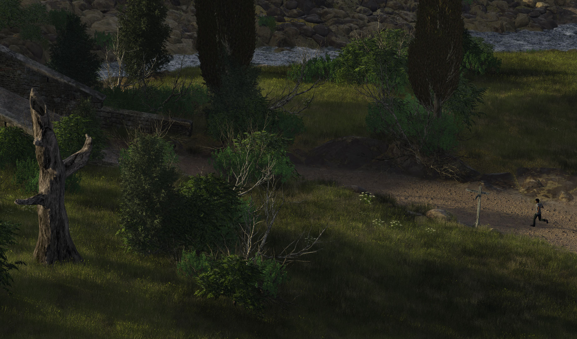
;D ;D Thanks guys. This thought me that it's interesting to pick a reference (building or landscape) and work something out from there. As for the darkness; I agree, but that's easy to change. And the guy is the only proper model I had that I could dump on that road. I'm not a person modeler (not good enough). He's running after his father on the wagon, who forgot his lunch ;)

Title: Re: Ponte Salario
Post by: Jo Kariboo on October 25, 2012, 03:56:05 AM
Post by: Jo Kariboo on October 25, 2012, 03:56:05 AM
Very impressing !!! Very nice composition !!!
Title: Re: Ponte Salario
Post by: Icegrip on October 25, 2012, 10:45:39 AM
Post by: Icegrip on October 25, 2012, 10:45:39 AM
Impressive Ulco, nice to follow the progress being made. Animation would be cool 8)
Title: Re: Ponte Salario
Post by: otakar on October 25, 2012, 12:18:55 PM
Post by: otakar on October 25, 2012, 12:18:55 PM
Even better now. Another one to print out...
Title: Re: Ponte Salario
Post by: Henry Blewer on October 26, 2012, 10:00:49 PM
Post by: Henry Blewer on October 26, 2012, 10:00:49 PM
I liked the little chapel in the distance. This is really awesome. Are you modeling your own trees now? The two dead ones look very good.
Title: Re: Ponte Salario
Post by: Dune on October 27, 2012, 03:24:06 AM
Post by: Dune on October 27, 2012, 03:24:06 AM
Thanks Henry. Well, I left the chapel out as it wasn't really an Italian style, but it would have been nice to have something there indeed. And I did make the dead ones, the branched ones in XFrog, the stump in Lightwave.
Title: Re: Ponte Salario
Post by: TheBadger on November 02, 2012, 09:19:06 PM
Post by: TheBadger on November 02, 2012, 09:19:06 PM
Its another good one Ulco, thanks for showing all aspects to the project.
He is never going to catch up! I would drop dead by the time I got to the top of the bridge because I smoke. Hmmmm a smoke sounds good to me now, so much for trying to quit.
QuoteHe's running after his father on the wagon, who forgot his lunch
He is never going to catch up! I would drop dead by the time I got to the top of the bridge because I smoke. Hmmmm a smoke sounds good to me now, so much for trying to quit.
Title: Re: Ponte Salario
Post by: AP on November 02, 2012, 10:18:47 PM
Post by: AP on November 02, 2012, 10:18:47 PM
This is neat. There is so much going on here in this render.
Title: Re: Ponte Salario
Post by: Dune on November 10, 2012, 02:49:26 AM
Post by: Dune on November 10, 2012, 02:49:26 AM
One of a series of views to explore possibilities for an animation. But the road edge stonework needs adjustment for sure.

Title: Re: Ponte Salario
Post by: bla bla 2 on November 10, 2012, 04:30:41 AM
Post by: bla bla 2 on November 10, 2012, 04:30:41 AM
C'est avec quel logiciel tu fais le bâtiment ?
With what software do you building ?
With what software do you building ?
Title: Re: Ponte Salario
Post by: masonspappy on November 10, 2012, 05:14:51 AM
Post by: masonspappy on November 10, 2012, 05:14:51 AM
i want to make images like this when I grow up.
Title: Re: Ponte Salario
Post by: Henry Blewer on November 10, 2012, 08:08:45 AM
Post by: Henry Blewer on November 10, 2012, 08:08:45 AM
I think the road needs some wheel ruts also. Perhaps some larger rocks sticking up to jar the wagons...
This last render shows off your modeling very well.
This last render shows off your modeling very well.
Title: Re: Ponte Salario
Post by: Dune on November 11, 2012, 03:16:22 AM
Post by: Dune on November 11, 2012, 03:16:22 AM
It is complicated as it is, so I don't think I'll add the wheel ruts, although it would 'only' be some extra warped thin lines used as masks. I did make the 'rut areas' of the road lower, as if they were worn by loads of wagons, and the finer ruts subsequently eroded a bit again. I think the rut area gravel needs to be a little finer, that's something easy to implement.
I do the objects in Lightwave, blabla. After a lot of trials and frustration I'm getting the hang of it (a bit).
I do the objects in Lightwave, blabla. After a lot of trials and frustration I'm getting the hang of it (a bit).
Title: Re: Ponte Salario
Post by: TheBadger on November 12, 2012, 01:43:44 AM
Post by: TheBadger on November 12, 2012, 01:43:44 AM
I like the road as is. Just the edges need work... As you already mentioned. A little haze might be nice too, but thats just some back seat driving.
Title: Re: Ponte Salario
Post by: Hannes on November 12, 2012, 03:11:03 AM
Post by: Hannes on November 12, 2012, 03:11:03 AM
Wow!!!
Title: Re: Ponte Salario
Post by: Tangled-Universe on November 12, 2012, 07:24:20 AM
Post by: Tangled-Universe on November 12, 2012, 07:24:20 AM
Yeah, like Hannes, just great work Ulco. Simply great work. Looking forward to see what you will do next.
If you're getting the hang of LW/modelling, why not try to export some nice TG cliff and model a castle or "cave houses" or suspended houses (fantasy/sci-fi like)?
If you're getting the hang of LW/modelling, why not try to export some nice TG cliff and model a castle or "cave houses" or suspended houses (fantasy/sci-fi like)?
Title: Re: Ponte Salario
Post by: Kadri on November 13, 2012, 02:14:32 AM
Post by: Kadri on November 13, 2012, 02:14:32 AM
I like the last one more Ulco. It looks very nice.
The only thing that i wanted to change would be the textures and or structures of the rocks on the 2 sides of the road.
Title: Re: Ponte Salario
Post by: Dune on November 13, 2012, 05:09:37 AM
Post by: Dune on November 13, 2012, 05:09:37 AM
That's exactly what I'll do, Kadri, Badger. And I'll make it a little hazier.
Good idea to keep in mind, Martin, but I'm extremely busy right now, so progress in TG is slow anyway.
Good idea to keep in mind, Martin, but I'm extremely busy right now, so progress in TG is slow anyway.
Title: Re: Ponte Salario
Post by: Dune on November 15, 2012, 12:49:47 AM
Post by: Dune on November 15, 2012, 12:49:47 AM
A little hazier and some better roadsides. Good enough for animation I'd say. You can keep on going forever adjusting with these things (sigh)....

Title: Re: Ponte Salario
Post by: masonspappy on November 15, 2012, 03:46:18 AM
Post by: masonspappy on November 15, 2012, 03:46:18 AM
My 2 cents: stop there. It's beautiful and amazingly realistic.
Title: Re: Ponte Salario
Post by: inkydigit on November 15, 2012, 09:38:08 AM
Post by: inkydigit on November 15, 2012, 09:38:08 AM
looks awesome Ulco...though is it me, or is the bridge really steep?
:)
:)
Title: Re: Ponte Salario
Post by: Dune on November 15, 2012, 11:22:22 AM
Post by: Dune on November 15, 2012, 11:22:22 AM
It is very steep, these guys must have had a hard time getting their loads across. You can see in the painting, first page, that it's steep as well.
Title: Re: Ponte Salario
Post by: Henry Blewer on November 15, 2012, 01:11:55 PM
Post by: Henry Blewer on November 15, 2012, 01:11:55 PM
It was probably a toll bridge at some point. Awesome renders. The road does look much better.
Title: Re: Ponte Salario
Post by: Dune on November 19, 2012, 02:42:05 AM
Post by: Dune on November 19, 2012, 02:42:05 AM
I'll post until you're all sick of me ;D Here's another view. It's ready for animation now, something Oshyan will dive into soon. So hopefully early next year....

Title: Re: Ponte Salario
Post by: Oshyan on November 19, 2012, 02:42:49 AM
Post by: Oshyan on November 19, 2012, 02:42:49 AM
Love the lighting and haze on that last one!
- Oshyan
- Oshyan
Title: Re: Ponte Salario
Post by: Dune on November 19, 2012, 02:47:56 AM
Post by: Dune on November 19, 2012, 02:47:56 AM
Thanks. I'll leave it as it is then, when I send it over.
Title: Re: Ponte Salario
Post by: Oshyan on November 19, 2012, 02:48:41 AM
Post by: Oshyan on November 19, 2012, 02:48:41 AM
Yes, perfect for an early morning shot. :)
- Oshyan
- Oshyan
Title: Re: Ponte Salario
Post by: mhaze on November 19, 2012, 04:17:27 AM
Post by: mhaze on November 19, 2012, 04:17:27 AM
moody and mystical
Title: Re: Ponte Salario
Post by: Tangled-Universe on November 19, 2012, 04:36:24 AM
Post by: Tangled-Universe on November 19, 2012, 04:36:24 AM
The last one is a great one Ulco!
Title: Re: Ponte Salario
Post by: zaxxon on November 19, 2012, 08:56:26 AM
Post by: zaxxon on November 19, 2012, 08:56:26 AM
The atmosphere creates a wonderful mood in a classic scene. And the torrent provides not only compositional interest (and technical interestl!), but infuses an otherwise tranquil setting with a nicely measured degree of energy. Beautiful!
Title: Re: Ponte Salario
Post by: Henry Blewer on November 19, 2012, 09:46:41 AM
Post by: Henry Blewer on November 19, 2012, 09:46:41 AM
You have done so much great work. This is definitely my favorite.
Title: Re: Ponte Salario
Post by: Dune on November 19, 2012, 11:58:47 AM
Post by: Dune on November 19, 2012, 11:58:47 AM
Thanks guys. The only thing I changed after this render is the extent of wetness along the stream. It is a bit too much here. And you might have noticed that the range of trees in the distance doesn't cover the right hand side. Remnant from the earlier view.
Title: Re: Ponte Salario
Post by: TheBadger on November 20, 2012, 11:13:08 AM
Post by: TheBadger on November 20, 2012, 11:13:08 AM
Looks great Ulco. Haze is really working for me too. Seems to help add a lot of depth, or character to the image.
Really, the worst part about 3D work is not the learning curves, or the complex software interactions, or the costs involved. Its the waiting to see new stuff ;)
No complaint, I hate waiting between eposodes of my favorite TV shows too ;D
Looking forward to the sequence Ulco and Oshyan. Good luck!
QuoteIt's ready for animation now, something Oshyan will dive into soon. So hopefully early next year....Is that the really the tentative render schedule, or are you guys just teasing a little?
Really, the worst part about 3D work is not the learning curves, or the complex software interactions, or the costs involved. Its the waiting to see new stuff ;)
No complaint, I hate waiting between eposodes of my favorite TV shows too ;D
Looking forward to the sequence Ulco and Oshyan. Good luck!
Title: Re: Ponte Salario
Post by: Dune on November 20, 2012, 01:08:06 PM
Post by: Dune on November 20, 2012, 01:08:06 PM
Thanks for your support, Michael. This haze is something I didn't know until one of you guys (who?) posted about a localized cloud layer without PF as local haze. Works fine!
I can't stand waiting either, being very impatient myself. I want something and I want it now! So I understand you very well. Oshyan will do a great job, I'm sure, as he did with the Garden of Eternity. And he has a certain deadline 8) ;) ...
I can't stand waiting either, being very impatient myself. I want something and I want it now! So I understand you very well. Oshyan will do a great job, I'm sure, as he did with the Garden of Eternity. And he has a certain deadline 8) ;) ...
Title: Re: Ponte Salario
Post by: Oshyan on November 20, 2012, 01:29:28 PM
Post by: Oshyan on November 20, 2012, 01:29:28 PM
Many lessons learned on the Garden of Eternity (and tools improved through time) will help this one come about much quicker. :D
- Oshyan
- Oshyan
Title: Re: Ponte Salario
Post by: FrankB on November 20, 2012, 01:52:30 PM
Post by: FrankB on November 20, 2012, 01:52:30 PM
OMG! Totally missed this thread!
Ulco, this is amazingly beautiful! Hands down the best and most complex TG2 scene I have seen since... Well maybe ever.
Frank
Ulco, this is amazingly beautiful! Hands down the best and most complex TG2 scene I have seen since... Well maybe ever.
Frank
Title: Re: Ponte Salario
Post by: inkydigit on November 20, 2012, 03:16:13 PM
Post by: inkydigit on November 20, 2012, 03:16:13 PM
I am almost speechless after the last one!
:)
:)
Title: Re: Ponte Salario
Post by: Dune on November 21, 2012, 02:27:01 AM
Post by: Dune on November 21, 2012, 02:27:01 AM
;D Thanks guys!
Title: Re: Ponte Salario
Post by: FrankB on November 21, 2012, 05:26:53 AM
Post by: FrankB on November 21, 2012, 05:26:53 AM
Actually love this on my desktop. I gave it a bit of a vintage look in post.

Title: Re: Ponte Salario
Post by: Tangled-Universe on November 21, 2012, 05:29:07 AM
Post by: Tangled-Universe on November 21, 2012, 05:29:07 AM
That postwork is totally awesome Frank!
Title: Re: Ponte Salario
Post by: FrankB on November 21, 2012, 05:38:15 AM
Post by: FrankB on November 21, 2012, 05:38:15 AM
Thank you! Glad you like it. :-)
To be totally honest, I can't take a lot of credit for it. There is an awesome image manipulation program called Snapseed, which I have been using since a year now. It has some very sophisticated filters, and I am merely fine tuning and applying them.
And let's not forget that if it weren't for Ulco, there would be no image to throw effect filters on at all ;-)
I can totally recommend this program, it's also quite cheap. It runs on iOS (iphone/ipad) and Mac OS. I have no idea if it runs on Windows or other platforms - perhaps it does.
Frank
Title: Re: Ponte Salario
Post by: Dune on November 21, 2012, 12:06:55 PM
Post by: Dune on November 21, 2012, 12:06:55 PM
Very nice effect, Frank. Have to take a look at that little prog.
Title: Re: Ponte Salario
Post by: bla bla 2 on November 21, 2012, 12:08:52 PM
Post by: bla bla 2 on November 21, 2012, 12:08:52 PM
Wouah, on dirait un tableau de dessin.
Title: Re: Ponte Salario
Post by: Simius Strabus on November 21, 2012, 04:08:01 PM
Post by: Simius Strabus on November 21, 2012, 04:08:01 PM
One could use the vintage image on a postcard. Absolutely stunning! :)
Title: Re: Ponte Salario
Post by: Dune on November 25, 2012, 03:54:25 AM
Post by: Dune on November 25, 2012, 03:54:25 AM
A final one, with more restrained wet river edges, more trees in the distance and slightly more fill light. I changed the pops for the animation, so the trees are at different locations. No soft shadows this time, which from this POV doesn't make a huge difference.

Title: Re: Ponte Salario
Post by: mhaze on November 25, 2012, 07:27:06 AM
Post by: mhaze on November 25, 2012, 07:27:06 AM
Beautiful!
Title: Re: Ponte Salario
Post by: FrankB on November 25, 2012, 07:32:47 AM
Post by: FrankB on November 25, 2012, 07:32:47 AM
Hi Ulco, this is another beautiful render of that gorgeous scene.
Only one thing irritates me from this perspective: the bridge doesn't seem perpendicular to the stream, as it should be.
Cheera
Frank
Only one thing irritates me from this perspective: the bridge doesn't seem perpendicular to the stream, as it should be.
Cheera
Frank
Title: Re: Ponte Salario
Post by: efflux on November 25, 2012, 07:50:05 AM
Post by: efflux on November 25, 2012, 07:50:05 AM
Quote from: FrankB on November 21, 2012, 05:26:53 AM
Actually love this on my desktop. I gave it a bit of a vintage look in post.
This post effect is very cool. I think some of the greens in the original are too bright. I had a TG2 image open in Gimp and accidentaly used a brush I had made to create dirty marks. It was strange how this effect just on one part of the picture made it look more like a photo.
Title: Re: Ponte Salario
Post by: Dune on November 26, 2012, 02:39:43 AM
Post by: Dune on November 26, 2012, 02:39:43 AM
QuoteOnly one thing irritates me from this perspective: the bridge doesn't seem perpendicular to the stream, as it should be.I know, Frank. It can easily be adjusted, but in this case the river may have shifted over time ;)
Title: Re: Ponte Salario
Post by: Tangled-Universe on July 16, 2014, 04:20:31 PM
Post by: Tangled-Universe on July 16, 2014, 04:20:31 PM
Hi Ulco,
Stewart from XFrog is interested in knowing which combination of plants you used here?
Since you're not on FB and others might be interested as well I thought I'd ask it in public rather than by PM. If you don't mind :)
Please let me know and I'll pass the message along :)
Cheers,
Martin
Stewart from XFrog is interested in knowing which combination of plants you used here?
Since you're not on FB and others might be interested as well I thought I'd ask it in public rather than by PM. If you don't mind :)
Please let me know and I'll pass the message along :)
Cheers,
Martin
Title: Re: Ponte Salario
Post by: Dune on July 17, 2014, 02:40:55 AM
Post by: Dune on July 17, 2014, 02:40:55 AM
I'll have a look.
Title: Re: Ponte Salario
Post by: Dune on July 17, 2014, 02:46:05 AM
Post by: Dune on July 17, 2014, 02:46:05 AM
SH15-grey willow
EU28a- common juniper
ML05- Italian Cypress
The rest (some grasses, about 4 shrub and 5 trees) are homemade.
EU28a- common juniper
ML05- Italian Cypress
The rest (some grasses, about 4 shrub and 5 trees) are homemade.
Title: Re: Ponte Salario
Post by: archonforest on July 17, 2014, 03:50:06 AM
Post by: archonforest on July 17, 2014, 03:50:06 AM
I just saw it now :-[
Great render!!!
Great render!!!